- Balance (individual units being over- or underpowered, certain styles not being viable, "how to fix tech" debate)
- Economy (Pay-2-Win elements, reward balance, ability for low spenders to keep up)
- Quality of Life (usability of the app and other things that have impact on the experience without being related to 1 or 2)
Today, I want to focus on #3. Partly because Redwood recently announced the introduction of some vanity features. This is generally laudable, as it opens revenue sources that are not related to the "Pay 2 Win" elements of Rivals. The connection to "Quality of Life" is that if implemented badly, these new things could make the usability of the game much worse. If you don't know yet what I'm talking about, watch the video below:
The feedback on this video so far was mostly negative, focused on the quality and style of graphics and voice overs. Check the Reddit thread if you want to read this feedback.
Yet, my main worry is that one player's vanity features reduce the usability of the game for the other player. Hence, my strong recommendation to Redwood: Allow players to deactivate the visual and audible impact of their opponents' vanity purchases such as unit skins, taunts, in-game animations. It's okay to make an exception to small visuals or short audio – but it needs to be subtle, and spam must be prevented.
Below, find a list of additional Quality of Life changes I'd suggest.
Username Changes
There's also downsides to allowing user name changes, especially if you can do it repeatedly. But there's little speaking against at least a one-time username change. Some ways to implement it so that it could be good for the developers include:- Allow a one-time change for free for Tiberium players
- Put a Diamond cost to changing your username, e.g. 100 Diamonds, and then 100 Diamonds more for each repeated change (100, 200, 300, ...)
- If it's too low priority to implement, but it could be done manually: Consider to offer it manually as a 1,000 Diamond purchase ($10 revenue for probably small effort), or consider it as a courtesy for your loyal spenders (e.g. offer it as a one-time option for players who spent more than $X00 on the game
Unit Filter in C&C TV
One of the obvious goals of the game is to promote diversity of play. Diversity of play is generally desirable from a fun perspective, but it also means players want to level up more units, which can increase their spend.
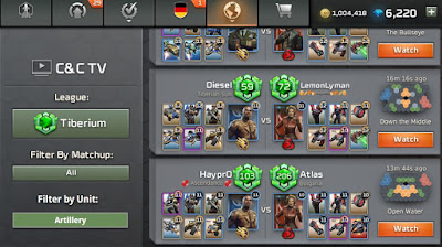
At the same time, many rarely used units that seem fun are hard to play. And because they are rare, it's not easy to learn from other good players. But there's an easy fix: Put a unit filter into the C&C TV replay interface. See this mock-up:
That would allow fans of a unit to easily explore in which deck compositions a unit is used, and how good players approach the game and use the unit.
Alliance Comfort
For alliances, I suggest two small changes:
- Make links in the alliance description clickable. This is not more abuse-able than the alliance name, and the reporting feature can still flag bad links. If the devs want to play it safe, they could restrict it to discord links, so that it's at least easier to contact the alliance / chat with them.
- Allow it to invite players in your match history to your alliance. This could be a powerful feature, and help with community building and retention of newer players. Imagine a new player playing their first games, losing against a good player, and then getting an alliance invite from them. I bet that would be a cool, friendly user experience for many new players that would make Rivals more persomable and engaging. To prevent spam, this feature could be limited to e.g. 1-3 invites a day, and potentially allow players to toggle that they do not want to be invited at all (e.g. to spare AliciaDestiny invite-spam from 100 alliances)
Masters Map pool
You could argue that this is a bit off-topic, as it's a bit of a balance / meta related ask. But as there are so many good, balanced maps, I feel it's mostly a quality-of-life feature. And a really, really important one.Why is it important?
- Especially many of the most active players will spend a lot of time in Masters. It has gotten harder to get to Tiberium (without L10 units, many will not make it). But due to win streaks and challenge matches, it's relatively easy to reach Masters for competent players that play for more than a month.
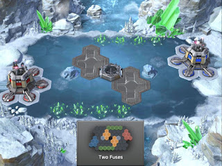
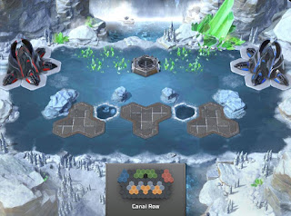
- Two of the maps (Pillbox and Tiberium Stripes, s. map images below) can feel a bit similar, and one is disliked by many players (Canal Row). I personally actually have grown to appreciate Canal Row for being different – but that's also because I only play it for a couple of days each season before I'm back in Tiberium. I would not want to play it all month long.
Why isn't the Masters map pool changed actually?
The reason the devs give is that it takes a lot of time and effort to change the design of maps. And that they would need to do that, as each league has their own theme ("red dust" for Iron, "beach" for Gold, "volcanic" for Platinum etc.).
But in my view this reason is not valid! Why?
- The argument is also not used for Tiberium, even though Tiberium also has it's own style / flavor in the screen before you start a match.
- Which is good, because Tiberium players prefer a good selection of map (and some rotation each season) over some aesthetic detail. But: This is also true for Masters players! Especially as in recent months, it has gotten harder for new players to get to Masters (due to unit levels going up a bit over time). Masters players also prefer map diversity over this artificial design limitation.
- There are even some ice maps that could be used for Masters – because Bronze League has the ice design, too! See the below list of map images.
So, my recommendation: For next season, expand the Masters map pool with the three maps "Down the Middle", "Open Water" and "Hand and Half". This would make the Masters map pool much more diverse and probably even make Canal Row much less of an issue, because you play it just every 8 matches.
Masters League maps:
Two Fuses (my favorite Masters map)
Tiberium Stripes
Pillbox (yes, not fully identical to Tiberium Stripes, but enough similarities to make certain strategies/matchips feel not that different)
Peaks and Valleys (I like that it's also quite different from nearly all other maps, but it also can get old if you play it too often)
Canal Row (the narrow choke can make it feel very annoying if you don't have enough fast air (incl JJTs or 2-range units, and it also can feel very tough to overcome level differences as there's less room to micro open fights)
(Some of the) Bronze League maps:
Open Water (good enough for the Tiberium map pool, and quite different from other Masters maps)
Half and Half (very different from many maps, as the harvester harass scouting lane is very different from the pad control lane; on basically all other maps a 3-vision-range scout can cover both at the same time)
Down the Middle (another 2-pad map that still feels pretty different from Two Fuses)


No comments:
Post a Comment